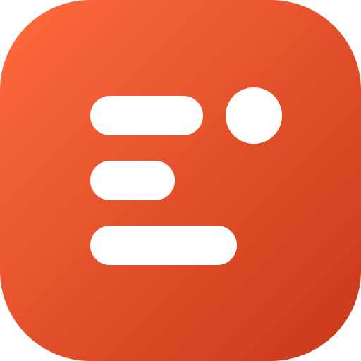
One mark, six small apps.
The Elight Labs logo, colors and type, and how to use them.




An E that switches on.
Three rounded bars form the E. They also read as a stack of apps. The dot beside the top bar is the light in Elight: a small signal that something is on.
The mark stays readable down to 16 px, the size of a browser tab icon.
Color
One warm accent on quiet neutrals. Coral is for the mark, links and the main action, never for large blocks of text.
#FF6A3D → #C8381A#17171A#F5F5F4#FDE9E2In dark mode the accent lightens to #FF7A57 and the background becomes #0E0E10, so text keeps WCAG AA contrast.
Type
Geist, semibold, tight tracking for headlines.
Geist regular for body text, at a comfortable 1.55 line height. One family across the whole site, self-hosted, with the system font as a fallback.
Geist is by Vercel, released under the SIL Open Font License.
The app family
Each app keeps its own icon and color. The Elight Labs mark ties them together on this site and in the stores.
 Elight Studio
 Slomoly
 Rabese
 Maneki Dict
 Simple Reader
 Egg Island
Logo files
Use the files as they are: don't recolor the mark, stretch it, or add effects. Leave space around the logo at least as wide as the dot.